Prompt is not a style
A thousand prompt packs sold online. Zero of them make a brand look like itself. Style is decided in the four hours after the render — not the four seconds before.
There is now an entire economy of prompt marketplaces. You can buy "the cinematic look," "the 90s editorial look," "the Wes Anderson look," "the high-fashion look," the "A24 look." Each one is a text string, somewhere between fifty and three hundred words long, with a list of negative prompts and a set of suggested models.
We have bought most of them. We keep buying them, actually, because occasionally a good one surfaces and it's worth the price of admission to see what someone else figured out. But after three years of testing them against real client work, the verdict is simple:
A prompt is not a style. A prompt gets you into the room where style might happen.
The actual work — the part that makes a frame *recognisably yours* instead of recognisably a prompt-pack customer's — happens in the four hours after the render, not in the four seconds before.
What a great prompt actually does
A prompt is a shortcut through a possibility space. It collapses millions of possible outputs into a narrower band. A *great* prompt collapses that band to something coherent enough to work with. That's it. That's the whole job of the prompt.
A great prompt does not:
- Decide the final frame.
- Guarantee a consistent look across a campaign.
- Encode your brand's specific taste.
- Compensate for a lack of taste on your end.
It gets you to frame one of one hundred that might be the right starting point. The other ninety-nine are the job.
What happens in the four hours after
Let's walk through what actually happens when a render lands on our timeline. This is the stuff nobody sells in a prompt pack, and it's 80% of the work.
Selection. We generate in batches. A typical hero frame comes out of 20 to 60 candidates. Selecting the right one is a taste call — not "which is the best lit" or "which is the most technically correct," but "which one has the specific weird energy this campaign needs." The candidate we pick is usually not the most beautiful frame in the batch. It's the one with the most intention.
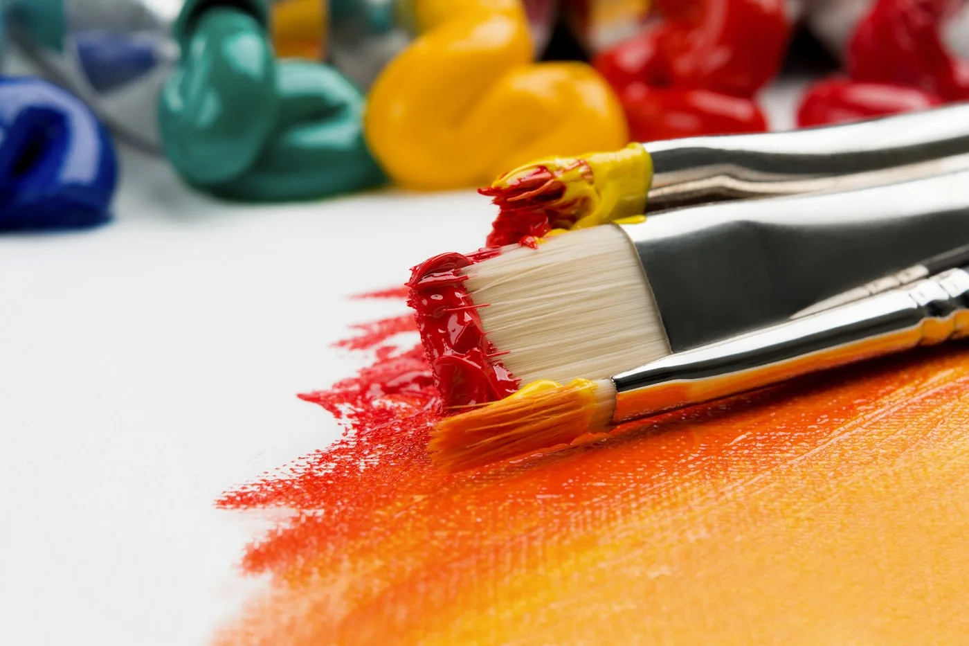
Re-grade. Models have a default colour temperament. Midjourney leans warm and creamy. Kling leans cinematic and slightly underexposed. Runway leans crisp and clean. None of those defaults are your brand. So every frame gets pushed through Lightroom or Resolve and re-graded to match the colour system we're building for the campaign. The difference between a frame that's "Midjourney-coloured" and "brand-coloured" is obvious once you see it, and invisible until you do.
Shadow side. The shadow side of a render is almost always where generative tools fail. The highlights look amazing. The shadows go muddy or plastic. Forty minutes in Photoshop, selectively lifting and re-texturing the shadow side, turns a "good AI image" into a "good image." This is thankless work. It is also the single highest-leverage retouching step we do.
Micro-detail. Hair, fabric folds, reflections, eyes. Models are getting better at these every quarter but they're never perfect on the first try. A frame we ship has had maybe twenty micro-edits that none of our clients will ever consciously notice — a stray hair moved, a reflection rebuilt, a button re-aligned. The whole point is that they *don't* notice, because the frame stopped feeling "generated."
Consistency passes. A campaign isn't one frame. It's a system. If the hero frame is graded one way and the secondary is graded another, the feed looks cheap even if each frame is individually great. Consistency across a set of twenty frames is a separate craft, and it's the step that most people skip because it's invisible when done right.
Why prompt packs make brands look the same
Because they're literally designed to. A prompt pack is sold to thousands of customers, who use it on the same base models, producing outputs that share 80% of their DNA. If three brands all bought "the cinematic luxury pack v4" this quarter, their feeds will not look like three different brands. They'll look like three different campaigns that all happen to use the same dialect.
Stock photography at least had the decency to be shared *images*, not shared *methods*. Prompt packs are worse because the sameness is harder to spot until the pattern clicks — and once you see it, you can't un-see it.
What we give clients instead
We don't sell prompts. We sell a pipeline where the prompt is one part and the taste is the rest.
What a client actually ends up with, after a campaign with us, is:
- A set of finished frames — the output they paid for.
- A grade profile — a reusable colour system tied to their brand.
- A reference deck — a moodboard of the frames that defined the campaign, annotated with why.
- A set of *their* prompts — we do write prompts, and we give them over, but the prompts alone would reproduce maybe 10% of the work.
That last point is important. If we handed a client every prompt we used and walked away, they couldn't reproduce the campaign. Not because prompts are secret — they're not — but because the prompt isn't the work.
The honest shortcut
If you want your brand to look like itself, there is no shortcut. There is a toolchain and there is a point of view, and the point of view is the whole product.
A prompt gets you into the room. Taste decides what leaves the room. Prompt packs sell you access to a room a thousand other customers are already standing in.